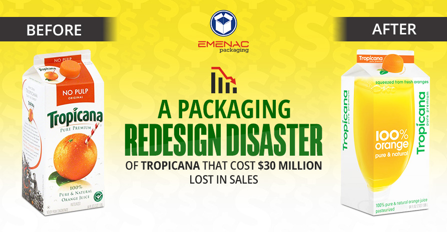
If you’re looking to reinvent your product packaging to shift your positioning in the market and attempt to reach new customer demographics, beware of your existing customers’ sentiments first. Otherwise, you may require to switch back to your original packaging design as happened to an American fruit-based beverage company, Tropicana.
The famous fruit juice brand, Tropicana, had a market share of $700 million per year for its best-selling product, Tropicana Pure Premium, back in 2008. The company spent $35 million on rebranding the product packaging which was not welcomed by the customers and cost $30 million lost in sales within two months’ duration.
Let’s explore the possible reasons why a rebranding venture becomes a packaging redesign disaster for Tropicana that costs $30 million lost in sales.
As packaging is the last point of brand communication that has the power to influence the customers to invest in the product. When you redesign it, you must retain the intrinsic qualities of the design to keep the customers connected with the brand
In the new packaging design, Tropicana used a generic glass of orange juice rather than employing the popular orange with a straw in the previous design. The generic design miserably failed to connect the customers’ emotional bond with the new packaging.
When customers buy something, they don’t search for the name of the product alone but it’s the brand imagery, packaging shape, and slogan that create a brand strong identity. It was missing in the new packaging of Tropicana.
In the new design of Tropicana Pure Premium, the focus was on the quality of the product such as “100% orange” while in the previous design, the pivotal point was Tropicana (brand name), and No Pulp (Quality of the product).
When you have a plan to redesign your packaging, it’s significant to measure the customer response through the controlled testing process. It will provide you with an idea about the buyer consideration phase and you need to deliver the same message to the customers by using relevant colors and tones.
Tropicana changes the tone by using “pulp free” instead of “no pulp”. The original packaging tone was conversational and friendly which was also used by the people in routine. However, the new message looked like a robotic tone that did not resonate with the customers’ habits.
Colors play a fundamental role in the brand’s visual identity that must be picked very wisely especially when you are in the process of redesigning your packaging. In the case of Tropicana, they were tremendously off from the original and natural color of orange. As in the previous design, the orange color was deep and saturated combined with rich green to inspire appetite and health. While the new design washed out the actual juice color to almost yellow.
Brands must use new trends and designs that help the customer to spot the product without any problem. The original design met all the needs of the customer as you can easily pick the orange with pineapple juice because of the unique purple label or the surrounding pineapple in the design along with the orange. If the customers somehow missed these messages the bold name of Tropicana would assist them to get the product.
All of these things were missing in the new design, there was no image of any real fruit showed in the design. On the other hand, the design was so inconsistent that never supported the customer to make a buying decision.
When you redesign your product packaging, it’s important to conduct a survey and a small experiment to evaluate its success. A US fruit juice brand, Tropicana, failed to include the important parameters while rebranding its packaging as conversational tone, right artwork, customer expectations, etc. which led to a straight failure of $35 million in rebranding costs with an additional $30 million lost in sales.